Next Tuesday is a big day for SEO professionals and really for anyone who has a website as it’s the launch of Google’s new mobile focused algorithm (or Mobilegeddon). Here are a few things your ministry website should know in advance of Mobilegeddon:
Algorithm Update Focused on Mobile
For years Google has been warning webmasters about optimizing their desktop sites for mobile usability. This upcoming update has been years in the making and will focus exclusively on whether your site is mobile friendly. From all indications this is not a standard release but rather a significant shift in Google’s rankings and focus. For example, prior to April 21 if you searched on a mobile device you would see the most popular organic results ranked in order. After next Tuesday though you’ll see the most popular MOBILE FRIENDLY sites ranked in order. So if your site is not mobile friendly, then you will see a rankings drop beginning next week.
This update may sound scary, but the good news is that Google is not scoring sites (yet); this algorithmic update is scored satisfactory/unsatisfactory (or mobile friendly/not mobile friendly). So if you’ve already got a mobile friendly site, then you’ll not likely experience anything alarming next Tuesday. Instead you may see your rankings rise as Google flushes out your non-mobile friendly competitors from Page 1.
What Does Mobile Friendly Mean?
So what exactly is a mobile friendly site? A mobile friendly site is one which displays correctly on smartphones, tablets etc. Mobile friendly sites render different layouts depending on the size of the browser screen, thus a mobile friendly site will adjust for these layout differences. From Google’s standpoint this makes sense as they would like to see a uniform standard for mobile sites to make it easier for users and for Google itself.
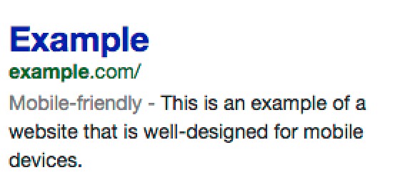
Is Your Site Mobile Friendly?
First step here is to check to see if you have a mobile friendly site in Google. Easiest way to find out? Search in Google for your website on a mobile device, once the link comes up look for light gray “Mobile-friendly” designation as shown here. If you see this then congratulations, you have a mobile friendly website in Google.
No access to mobile right now? Try this link. Simply type in your URL and Google will perform a mobility friendly test for you.
Not Mobile Friendly Yet? Try Responsive Design
One widely used configuration that Google recognizes in mobile is responsive design. Responsive design is where your desktop website’s content will adapt and render nicely on a mobile unit depending on the size of the window. When compared to a completely new mobile site, responsive design is easier to extend to other devices and is more effective SEO wise.
In some cases responsive design may not be right for certain publishers and businesses as simply moving content from a desktop screen to a smaller one may not be a strong user experience. However, I think the vast majority of ministry and church websites will be fine to stick with responsive design as a mobile design tactic for Google. For more detailed information on responsive design, here are Google’s own tips and instructions.
These are but a few tips and thoughts on Mobilegeddon and how Google is optimizing for mobile searches. Remember that it is rare for Google to announce algorithmic changes in advance much less give an actual date. I think this underscores the emphasis Google is placing on mobile optimization and, perhaps, in order to ward off panic among site owners, Google has taken these extra steps in order to ensure a smoother transition.